
In this entry I predict the Market Value of Dutch football players on the Eredivise. I use CART and Conditional Inference Trees to unveil the main characteristics.
Due to WordPress security reasons I cannot embedd the application here, so I post the link to the server where it is hosted.
Nonlinear PCA: Airbnb & Barcelona
Today I analyze the underlying relations in those properties posted in Airbnb in the city of Barcelona. To do so I make use of nonlinear PCA. But first let’s review some concepts: Principal Component Analysis (PCA) is a statistical technique which aims to describe the existing variables by creating new uncorrelated variables by means of linear combinations.
Throughout this paper I make use of Nonlinear PCA which is an extension of standard PCA. In a few words, this extension is capable of overcoming the problem of having categorical
variables and nonlinear relationships between variables.
The fact of having dierent types of variables, e.g. categorical, in a given dataset is a problem when performing standard PCA. This is due to the fact that the standard version of the technique uses numeric variables so as to compute variances between variables.
Furthermore, if there is presence of nonlinear relations between variables we may not be able to model them properly using standard PCA approach. However, nonlinear PCA is capable of managing these variables by applying nonlinear transformations to the variables by a process called optimal scaling.
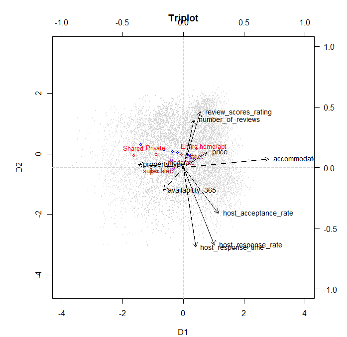
A triplot is a representation of category centroids, vector loadings and object scores. We can see some interesting features about variable loadings. Not all the variables load well in both dimensions. This can be seen for example for Accommodation which loads very well in the rst dimension, but not in the second. Furthermore, other variables such as price don’t load much in either dimension. This can be seen as this variable doesn’t have a strong relevance. Looking at Review Score Rating and Number of Reviews we can see that they have a small angle one to each other. This means that those properties with higher number of reviews tend to score higher in reviews. In addition to this fact, as the category centroid for Entire Apartment is right on the way of these vectors, we can also extract that those properties that get higher scores and more reviews are those where the entire property was rented. Very similar interpretation can be extracted from the response time, response rate and acceptance rate of the hosts. So, those hosts who are more responsive to potential guests messages are more likely to accept requests.
However, they take more time to answer these requests. A factor that could explain this
phenomena could be that these hosts receive too many requests and they manage to answer
them all but with some delay due to the high quantity of messages.
Another method to draw interesting conclusions from our data is to depict the object
scores for a certain variable but depicting each category with a dierent color. For instance, we can see that those properties that can accommodate more people and the host has veried his identity are usually more strict in their cancellation policy, see Figure 7 and Figure 6 in Appendix A. Again,a logical explanation could be that the host is more concerned about his property as it might be a larger and more expensive apartment, so he takes extra measures when renting it. This factor might be associated with a high opportunity cost as well. If guests decide not to go in the last minute, it is a big loss for the owner of the property as he could have rented to someone else, so to avoid this issue he sets a strict cancellation policy. Another point, is that those properties which oer a shared room, which imply a lower price, are located in poorer neighborhoods of Barcelona such as Horta-Guinardo or Nou Barris.
This could be induced by the fact that there is a very high rate of unemployment in these
areas, around 23% unemployment rate INE (2016), so in order to earn some money people
rent a shared room.


We could draw many more conclusions from this analysis. However, so as not to be boring I will stick with this ones and may write some more in the future.
How did Kobe Bryant shoot?
It is said that Kobe Bryant is one of the best basketball players ever. But, how real is this sentence? Is Kobe an excellent shooter? What’s his preferred spot? How does he shoot?
In this post I try to give some answers to these questions. To do so I make use of this dataset, which is available in Kaggle.
First, what I do is to depict the Staples Center with all the shots that Kobe has done. Notice that you have to download the image of the Staples Center (or the court you want) and arrange it so you can place coordinates on it. I do it using rasterGrob from packages jpeg, to load the image, and grid to create a grid of coordinates.
library(ggplot2)
library(jpeg)
library(grid)
courtimg courtimg p annotation_custom(courtimg, -300, 300, -115, 925)+
geom_point(alpha = 0.5)+
theme_bw()+
ylim(-80, 400)+
xlim(-280, 280)+
xlab('X')+
ylab('Y') +
scale_color_manual('Shots', values = c('tomato', '#00FF00'))+
ggtitle("Total shots by Kobe Bryant")+
theme(plot.title = element_text(lineheight=.9, face="bold"))
p
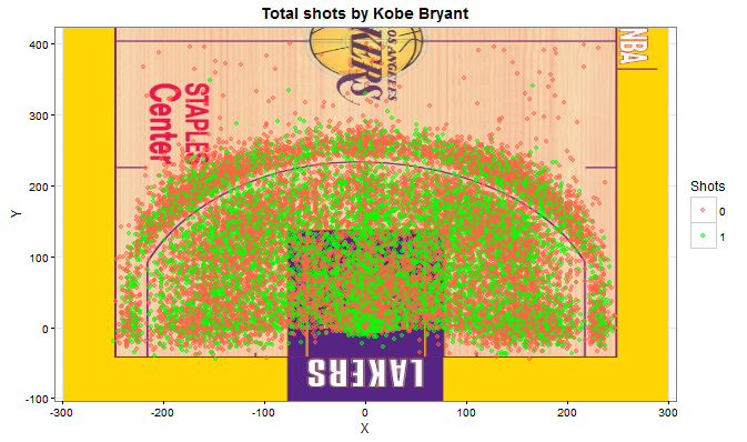
One can clearly see that Kobe has shot from all the possible spots in the field. Actually, there are some shots from the other side of the field, but I haven’t plot them so we can zoom in this part of the court, which is the important one.
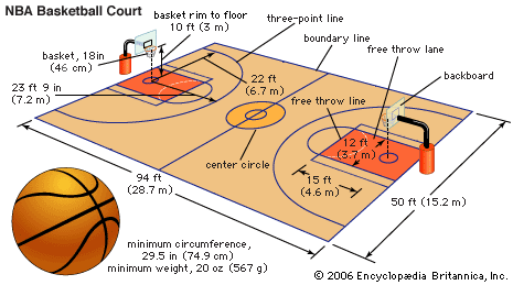
I would like to highlight that the distance of the three point line with respect to the basket in a NBA court differ depending on the position. I attach here a picture of the Encyclopedia Britannica with the official dimensions. Just right in front of the basket the distance is about 23.9 feet (7.2m), and on the side about 22 feet (6.7m).
If we look more carefully at the shots done by Kobe we will discover some interesting facts.
In the following plot we can see the density of shots by distance. In plain words, how many shots Kobe has done by distance. The green area represents scored shots and the red one is missed shots. The blue vertical line corresponds to the 3-points-line, which is between 6.7 and 7.2 meters. We observe that Kobe has a very high ratio of scored points at 0 metres, almost 30% of his points are under the basket. We can also see that he tries to score 3 points and he manages to score many points from there, but he misses many from there too. 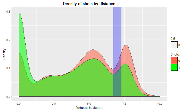 Next step is to calculate the probability of scoring from a certain distance. Given that we have the variable scored/missed we can perform a logit model of scored against distance.
logitshots logitshots
ggplot(df, aes(x =df$distance_meters,y = df$shot_made_flag)) + geom_point(alpha = 0.17) + stat_smooth(method = "glm", method.args = list(family = "binomial")) + xlab("Distance in meters") + ylab("Probability of scoring") + ggtitle("Probability of scoring by distance")+
theme(plot.title = element_text(lineheight=.9, face="bold"))
What we obtain is the following:
Intercept 0.3681
distance -0.0441
Notice that given it is a Logit model coefficients do not have a direct interpretation and we have to apply an exponential transformation: prob <- exp(linpr) / (1 + exp(linpr))
We can see in the following plot the probability of scoring given the distance with a logit distribution and then a more direct but more simplistic interpretation by means of a linear model applied to the logit.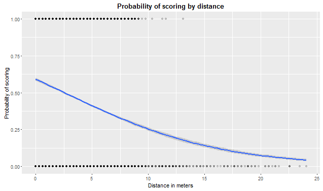
sdist <- 0:10
linpr <- 0.3681 - 0.0441 * sdist
prob  <- exp(linpr) / (1 + exp(linpr))
prob
And the linear specification taking into account logit coefficients. 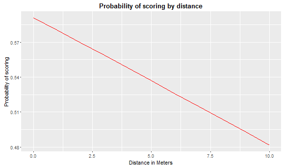
exp(-0.0441)
## [1] 0.9568583
odds <- prob/(1 - prob)
4.31%
We can compute the odds ratio and what we obtain is that for every meter farther that Kobe shoots from, the probability of scoring decreases in about 4.3%.
Finally, what we can see in this last plot is the kind of shot that Kobe has done. It is clear from this figure that Kobe really likes jump-shots, almost 80% of his shots are of this kind. We can also see the other types of shots he has done but the proportion is way smaller.
As a conclusion, Kobe Bryant has been one the best basketball players ever. We have seen the probabilities of scoring depending on distance and some other features like the position where he used to shoot or the type of shot. As we could have imagined, the farther he is the more unlikely it is to score.
Game of Thrones – A very bloody series
Today I am writing about Game of Thrones (GoT) and how the different kingdoms interact with each other. The dataset contains all the battles in the War of the Five Kings from George R.R. Martin’s A Song Of Ice And Fire series. I have to recognize that I have never seen GoT and actually I am not really interested in doing so as I do not like science fiction films/series. However, GoT seems to be really popular nowadays so there might be a quite a lot of people interested in knowing what is going on.
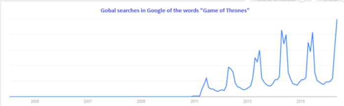
Searches in Google of the words “Game of Thrones”, via Google Trends.
I analyze who has engaged in some war; to do so I make use of this dataset where there is a description of who is engaged in each war and many other relevant information about them.
First of all I start by plotting which kings are attacking the most and which are being attacked the most.
library(ggplot2)
library(lattice)
histogram(wars$attacker_king, col = "tomato", main = "Who does attack the most?", xlab = "Attacker King")
histogram(wars$defender_king, col = "lightgreen", main = "Who is attacked the most?", xlab = "Attacker King")
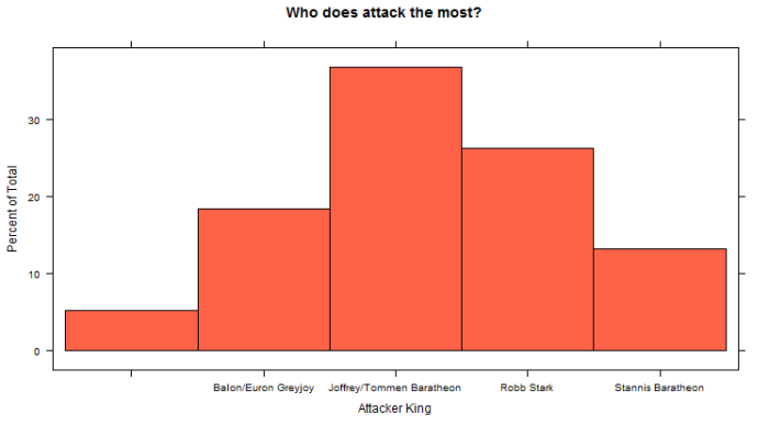
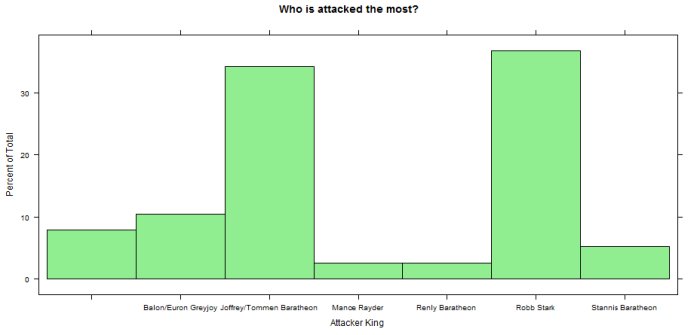
Notice that the first column is empty because it represents external actors who are not related to any Kingdom. What we see is that Joffrey/Tommem Baratheon is the King that is attacking the most by far, almost 40% of the wars have been started by him. On the other hand, Robb Stark and Joffrey/Tommem Baratheon are the ones who are being attacked the most. But who are they attacking? Are they attacking each other?
library(igraph)
warsnw <- wars[,4:5]
orgnet <- graph.data.frame(warsnw)
summary(orgnet)

plot(orgnet, layout = layout.reingold.tilford,vertex.label=V(orgnet)$name,vertex.shape="circle", vertex.size=20, asp=FALSE, edge.color="lightgreen", edge.arrow.size=0.7, vertex.color="yellow", main = "Game of Thrones Wars")
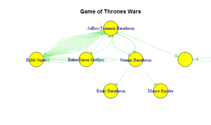 After plotting a network diagram showing who is attacking and who is being attacked we clearly see that it is Robb Stark and Joffrey/Tommem Baratheon who seem to have some kind of personal war. The have gone into war many times. It is interesting to see that more than 4 different kings have attacked Joffrey/Tommem Baratheon, so they might be the evil ones. (I’d see the series to give better explanations on this hehe).
Notice the strange figure on the right where the kingdom without name is attacking itself. This is due to the fact that all external actors which are not enclosed in a kingdom are in the same bag, so that edge is possibly because there has been some external war.
Finally I plot the wars network by the main attackers. I highlight that this plot is an interactive 3D plot. However, because I have had some problems trying to embedd the 3D plot here in WordPress I leave a screenshot of how it looks like.
warscomands <- wars[,c(6,10)]
comnet <- graph.data.frame(warscomands)
rglplot(comnet, vertex.label=V(comnet)$name,vertex.shape="circle", vertex.size=20, asp=FALSE, edge.color="black", edge.arrow.size=0.7, vertex.color="green", vertex.label.dist=0.5, edge.arrow.mode=2, edge.arrow.width=3)
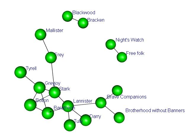
What we observe is that there is a strong connection between Kings Stark and Baratheon. We can see this feature by looking at the main attackers, who in a large number of occasions involve Stark, Baratheon, Lannister, Bolton and Greyjoy; it is not casual that the whole plot of the series goes around these characters.
This is it for today, we have seen some analysis of the wars in which Game of Thrones main characters are involved and how they relate to each other. Interestingly, Stark and Baratheon are the bad guys, they are always in trouble.
In another post I will do some survival analysis trying to predict who will die in the next season.
When winning an Oscar means living ten years more
This is a short post analyzing how winning an oscar affects life expectancy.
I am analyzing it from a very very simple analytical and econometrical approach and there might be other factors affecting longevity that I do not take into account. For instance, actors are from a high income class, they have access not to good services but to the best ones, and many other things. So for sure there are hidden components that I omit.
However, I compare US male life expectancy from 1929 to 2016 to lifespan of actors that have won an Academy Award.
ggplot(data = df[df$year <2000,], aes( x = df$year[df$year <2000], y=df$age_actor[df$year <2000])) + geom_point(color ="blue") + geom_point(data = df[df$year <2000,], y = df$life_expectancy[df$year <2000], color="red") + geom_smooth() + ggtitle("Do Actors that have won an Oscar live longer?")+
     theme(plot.title = element_text(lineheight=.8, face="bold")) +xlab("Year") + ylab("Death age")
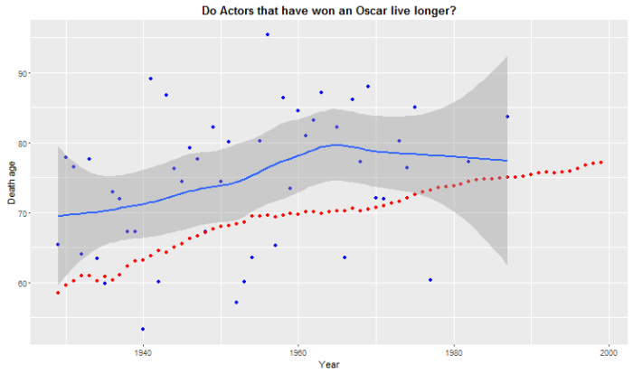
Blue dots are the age of death of actors that have won an Oscar while the red line is the evolution of life expectancy in the US. The blue line is an adjusted moving average for the age of death of the actors. What we see is that it is consistently higher than the national life expectancy figure. Actually if we compute the mean we appreciate that they live about 10 more years than the average US male citizen.
ggplot(data = df[df$year <2000,], aes( x = df$year[df$year <2000], y = df$diffage[df$year <2000])) + geom_point(color="darkgreen") + ggtitle("Oscar winners live more than the average Life Expectancy")+geom_hline(yintercept = 0, color = "red")+
     theme(plot.title = element_text(lineheight=.8, face="bold")) + xlab("Year") + ylab("Difference between Death Age and Life expectancy")
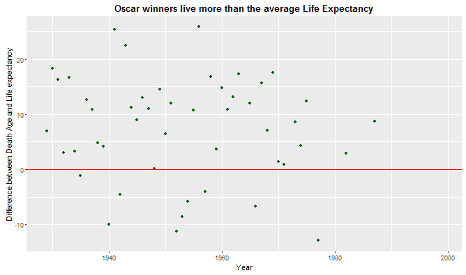
This second plot shows the gap between life expectancy and the age of death. All the green points above the red line mean that a given actor has lived X years more than the average. Points below the red line mean that the actor has died before arriving at the expected life expectancy figure.
So as a conclusion, it is crystal clear that actors that have won an Oscar prize live way longer than the national male average. This may be caused by many factors like access to healthcare, excellent standards of living among others. It is fair to say, that I thought results would be the other way round following the argument that they may go crazy and may take part into risky activities like doing drugs, drinking etc. But this argument fails when looking at the main figures.
La Liga: Do richer clubs perform better?
La Liga 2015/16 is over. FC Barcelona has won it with 91 points, Real Madrid has ended in the second position with 90 points. But how important is to have a large budget to succeed in the Spanish football league, la Liga?
I use of statistics provided by Marca together with official Budget reports for the season 2015/16.
First of all I run a Linear Regression, we’ll keep it simple, of Budget against Points, it is to say how important budget is to determine the total points in the end of the season.
library(ggplot2)
library(ggrepel)
ggplot(df, aes(x=df$Presupuesto, y = df$puntos, label= df$Equipo)) + geom_point( aes(color = df$Ascenso)) +
  geom_smooth(method='lm',formula=y ~ x)+  geom_label_repel(aes(fill = df$Ascenso), colour = "white", fontface = "bold") + ggtitle("La Liga: Budget vs Points") +
     theme(plot.title = element_text(lineheight=.8, face="bold")) + xlab("Budget") + ylab("Points")  + guides(fill=guide_legend(title="Position"))
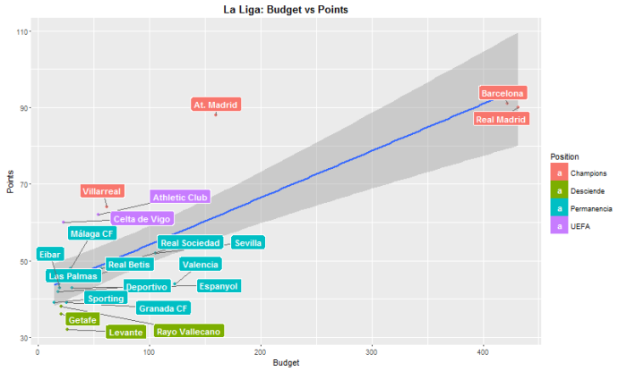
Results show clearly how important budget is. Real Madrid and FC Barcelona with a budget over 420M€ clearly outperform all the other teams. It is remarkable that Atlético de Madrid with “only” 160M € has managed to get similar quotes of success with 88 points (it’s not casual that Atlético de Madrid is in the final of Champions League).
The coefficients of a linear regression show an intercept of 42.02 and a coefficient of 0.1223 and it is significant at the 99%. In plain words, on average any team will get 42 points in the end of the season in addition to his, every 8M € more a team has, it will manage to get 1 more point. We can see how this prediction works by multiplying this 0.1223 times the budget a team has and adding the intercept, 42.
Predicted Points = 42.02 + 0.1223 * Budget
However, the fact that 3 teams, Real Madrid, FC Barcelona and Atlético de Madrid, have a disproportioned budget may introduce some kind of bias in the estimators, to correct this fact we’ll consider them as outliers and I will get rid of them, redoing the analysis we obtain the following:
ggplot(df[4:20,], aes(x=df$Presupuesto[4:20], y = df$puntos[4:20], label= df$Equipo[4:20])) + geom_point( aes(color = df$Ascenso[4:20])) +
  geom_smooth(method='lm',formula=y ~ x)+  geom_label_repel(aes(fill = df$Ascenso[4:20]), colour = "white", fontface = "bold") + ggtitle("La Liga: Budget vs Points excluding top 3") +
     theme(plot.title = element_text(lineheight=.8, face="bold")) + xlab("Budget") + ylab("Points")  + guides(fill=guide_legend(title="Position"))
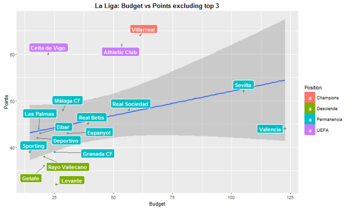
Graphically this second plot looks quite alike to the first one with all the teams. However this slope is a little bit flatter. And more importantly, the coefficient of the linear regression is not significant anymore, p-value=0.155. The lower slope can be seen on the coefficient, which now is 0,1045 instead of 0.1223. The fact that the coefficient is not significant leads to think that there may not be direct and causal relation between budget and total points when we look at smaller teams.
Finally it is possible to compare between games won at home against games won away to see which teams perform better a away than at home.
ggplot(df, aes(x=df$Gana_Casa, y = df$puntos, label= df$Equipo)) + geom_point( aes(color = df$Ascenso)) +
  geom_smooth(method='lm',formula=y ~ x)+  geom_label_repel(aes(fill = df$Ascenso), colour = "white", fontface = "bold") + ggtitle("La Liga: Games won at Home vs Total points") +
     theme(plot.title = element_text(lineheight=.8, face="bold")) + xlab("Games won at Home") + ylab("Points")  + guides(fill=guide_legend(title="Position"))

ggplot(df, aes(x=df$Gana_fuera, y = df$puntos, label= df$Equipo)) + geom_point( aes(color = df$Ascenso), le) +
  geom_smooth(method='lm',formula=y ~ x)+  geom_label_repel(aes(fill = df$Ascenso), colour = "white", fontface = "bold") + ggtitle("La Liga: Games won Away vs Total points ") +      theme(plot.title = element_text(lineheight=.8, face="bold")) + xlab("Games won away") + ylab("Points")  + guides(fill=guide_legend(title="Position"))
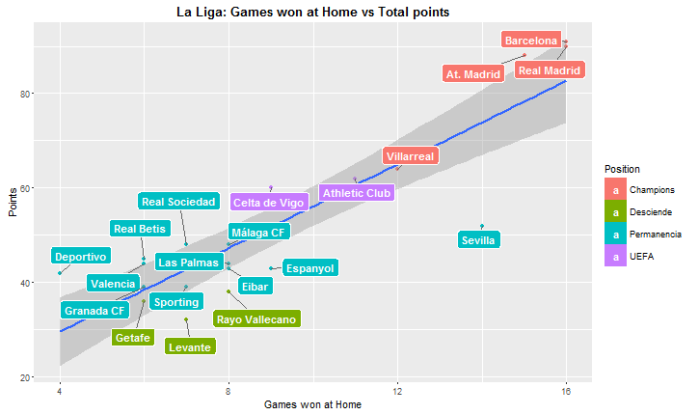
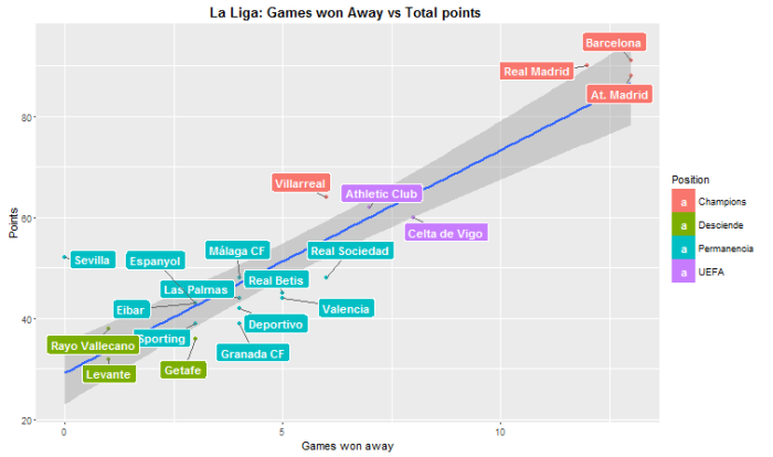
What we can see is that there are some teams that perform better abroad than at home. For example Celta de Vigo wins more games away than at home. There is a case that really catches my attention, Sevilla has won at home 14 games out of 19, quite a good statistic, however they have won 0 games away. It is to say, 0 out of 19. It’s the only team that hasn’t won abroad. This is an interesting data that Sevilla should take into account to fix this important issue. Even this disaster when playing away they have managed to end up in 7th position. From this plots we could argue that the most difficult fields to play at are Barça’s, Real Madrid’s, Atlético’s de Madrid, Sevilla’s and Villarreal’s.
From this data we can conclude that there might be some positive linear correlation between budget and total points when taking into the analysis the whole sample. If we exclude those three possible outliers results change a bit. However we’d rather stick to the first analysis and affirm that there might be a positive and significant correlation between budget and total points. We have also seen how teams behave when playing at home or away.
Climate change in Spain? Seasonal decomposition using R
This new post is motivated by this article, ¿Qué temperatura hizo el año en el que naciste?, which was written in La Vanguardia, one of the major newspapers in Spain, the 20th March 2016.
It is a captivating article which argues that in the recent times there has been a steady increase in the temperature in the area of Barcelona, and in Spain. The author uses several datasets, you can find them here in his github folder, to prove that this events are happening and we are moving to an era of high temperatures with the unpredictable changes that may come along with it. He makes use of really cool graphs and plots to convice the reader that this is going on. But is it really happening this temperature increase? Is the statistical analysis too superficial?
Without furher ado let’s start:
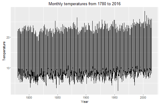
I use the dataset called long-data as it has the longest time span, from January 1780 to February 2016. It is data from Barcelona, Spain. This is how the whole data looks like; not very informative though:
df <- read.csv("long-data.csv" , header = TRUE, sep = ",")

library(reshape)
df <- melt(df, id.var = c("year"))
df <- df[with(df,order(year)),]
colnames(df)[2] <- "month"
colnames(df)[3] <- "temp"
ggplot(df[1250:1900,] , aes(x = df$year[1250:1900], y = df$temp[1250:1900]))+ geom_line() + scale_y_continuous("Temperature") + scale_x_continuous("Year")  + ggtitle("Monthly temperatures from 1780 to 2016")
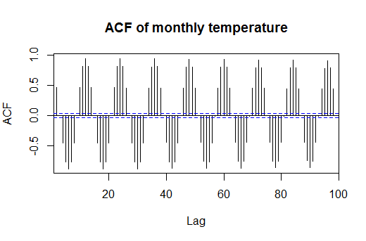
What I want to do exactly is to decompose the seasonal effect from the trend and from the noise. To do so there are several approaches, but in this occasion I will use and additive decomposition. Why? Because the seasonal variation looks like constant, we can see it if we look at the ACF (AutoCorrelation Function) of the temperature, I’ll set it to 120 lags, ten years.
acf(df$temp, lag = 100, main = "ACF of monthly temperature")
So now I proceed to decompose the seasonal effect from the trend. I’ll use the library called TSA, we could do it manually, but I’d rather do it using this package to save time.
It is important to recall how our time series works:
Additive Time Series:
Time Series = Seasonal + Trend + Random
library(TSA)
library(ggseas)
ts_air = ts(df$temp, frequency = 12)
decompose_air = decompose(ts_air, "additive")
I set frequency equal to 12 because we have monthly data, so we’ll tell R that our seasonal effects in our data repeat every 12 months.
ggsdc(df, aes( x=year,y = temp),
      method = "decompose",frequency = 12) +
   geom_line(colour = "#56B4E9", linetype=1, cex=0.5) +
   labs(x = " \n ", colour = "#56B4E9") +
   scale_y_continuous("Monthly average temperature in Barcelona\n") +
   ggtitle("Barcelona average temperature by month") +
   theme(legend.position = c("topleft"))
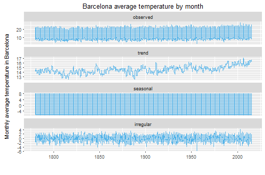
So here we have the decomposition. First plot, observed, is the first one I plotted here in this post, what we actually see. The second one is the trend that our data has. The third one, seasonal, is the seasonal effect, it looks weird because it is monthly data for 220 years, that’s more than 2000 observations, we’d look closer.
We can better see the seasonal component of our time series:
plot(as.ts(decompose_air$seasonal[2600:2700]), type = "l", ylab="Variation of Temperature", main = "Seasonal Effect")
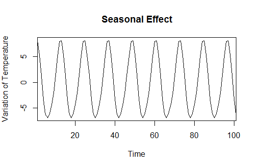
It’s clear from this plot that the seasonal effect is constant and doesn’t vary at all every year. This comes to explain that in winter temperatures are lower, about 5 degrees less compared to the mean, and in summer they are higher. Nothing new.
Now I plot the trend so we can have a better taste of it:
plot(as.ts(decompose_air$trend), ylab = "Temperature", col = "#56B4E9", main = "Trend of the Temperature")
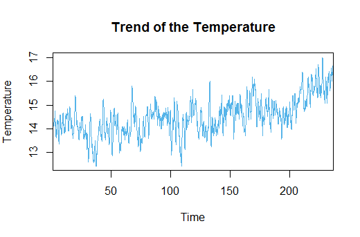
But this second plot is more interesting. It shows the trend of the temperatures for the last 220 years in Spain. A priori, and visually inspecting, we see it’s quite stationary with some years really cold and some other really hot. Well, we could expect that, we all know that not all years behave the same. However, let’s look closer to the last 30 years. It looks like there is a clear increase in the trend. So for the last thirty years actual adjusted temperatures seem to increase. To better see these facts I’ll carry out some tests:
First I am going to check if the Time Series is stationary. By stationary we mean that it moves around a centered mean. The most common test is Augmented Dickey-Fuller Test, and it’ll tell us whether the series is stationary or not. Furthermore, I’ll perform this test for the whole series, for the last 50, 30, 15 and 10 years.
adf.test(na.omit(decompose_air$trend))
adf.test(na.omit(decompose_air$trend[2232:2832]))  #Last 50 years
adf.test(na.omit(decompose_air$trend[2472:2832]))  #Last 30 years
adf.test(na.omit(decompose_air$trend[2652:2832]))  #Last 15 years
adf.test(na.omit(decompose_air$trend[2712:2832]))  #Last 10 years
We can see here the output of the ADF Tests.
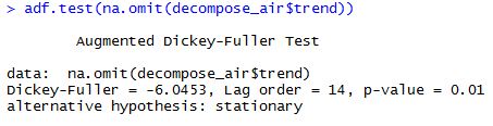
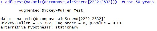
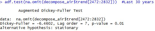
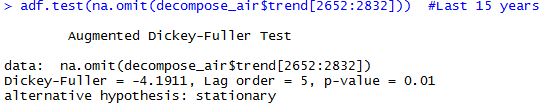
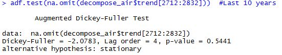
Cool, we reject the null hypothesis of non-stationarity in all the cases except for the last 10 years. All p-values are significant, smaller than 0.05, except the last one which is 0.5441, which leads to not reject the null so we have to accept the null hypothesis that our data is explosive. So from a statistical point of view it seems that there haven’t been any statistically significant changes in the temperature for the whole series but for the last 10 years, where there might be an statistically significant increase in temperatures in Barcelona.
Now I’m going to perform another test to see if there is a break, it’s to say a point where we go from stationary to non-stationary.
library(strucchange)
breakpoints(df$temp ~ 1)
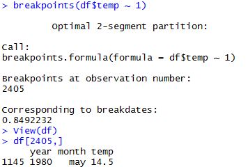
According to this test it seems that there’s a break in May 1980. So we can say, a grosso modo, that there might have been some increase in the temperature in the last 2-3 decades in the city of Barcelona. This is seen both by ADF test and the Breakpoint test using the library strucchange.
However, we have to be very cautious of these results as it is a very short time span, about 20 years, that seems to be some significant change. It is important to highlight that it may be a temporary or a permanent change, we don’t know it yet. It’d be interesting to see if factors like industrialization, economic growth or car production are affecting these changes or if it is a matter of randomness. But as said, it is very early to get robust conclusions, we’ll have to wait some more years to see if there is a real Climate Change or not.
Text Mining in R using Airbnb Barcelona datasets
In this post I’ll be explaining how to do some basic Text Mining (TM) using R. For this post I’ll be using Airbnb public datasets, specifically those from Barcelona.
You can find the data in this link: http://insideairbnb.com/get-the-data.html
To do this analysis I’ll be using the descriptions that the owners write when advertising their accomodations.
Firstly, what we do is to create a readable document so R can interpret it. We do it by downloading and calling for the library tm, designed for text mining. As you see what I do is to create a Corpus, and then we clean it by removing punctuation and numbers, converting to lower case, removing Spanish and English stopwords (I’ve done it in two languages as there are many descriptions in Spanish and many others in English).
library(tm)
corp <- Corpus(VectorSource(df$summary))
docs <- tm_map(corp, removePunctuation)
docs <- tm_map(docs, removeNumbers)
docs <- tm_map(docs, tolower)
docs <- tm_map(docs, removeWords, stopwords("english"))
docs <- tm_map(docs, removeWords, stopwords("spanish"))
docs <- tm_map(docs, PlainTextDocument)
dtm <- DocumentTermMatrix(docs)
dtm
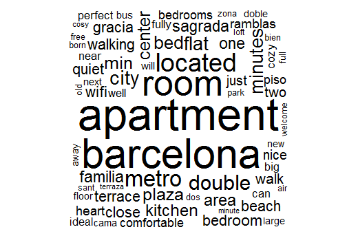
Now I decide to create a couple of word clouds, one with colours and with some logical order and another more basic but quite cool too.
library(wordcloud)
pal2 <- brewer.pal(8,"Set2")
wordcloud(docs, min.freq=10,
           max.words=100, random.order=F, rot.per=.3, colors=pal2)

wordcloud(docs,max.words = 150, random.order = F)
Here we have the first wordcloud

And the second one but more basic than the first one
Now what I do is to transpose the matrix we had created when cleaning the Corpus and group each word by frequency. Then I eliminate empty space, so we get a matrix which has a 90% of sparse terms. Finally, I create a matrix with all the words and its frequency. Using findFreqTerms we can see the most frequent words setting a lower threshold, in this case 2000.
tdm <- TermDocumentMatrix(docs)
tdm
freq <- colSums(as.matrix(dtm))
length(freq)
ord <- order(freq)
m <- as.matrix(dtm)
dtms <- removeSparseTerms(dtm, 0.90) # This makes a matrix that is 90% empty space, maximum.
inspect(dtms)
Finally I create a bar plot showing the words and its frequency only if they appear at least 1000 times.
library(ggplot2)
p <- ggplot(subset(wf, freq>1000), aes(word, freq))
p <- p + geom_bar(stat="identity")
p <- p + theme(axis.text.x=element_text(angle=45, hjust=1))
p   + ggtitle("Word Count")
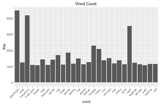
It’s clearly visible that the most frequent words are “Apartment”, “Barcelona,”room”, “located” and “metro. This is quite informative as we can see what is important when advertising an appartment.
We can see correlation between words using the following:
findAssocs(dtm, c("metro","bus", "tram"), corlimit=0.1) #word correlations
We have to specify a lower threshold of correlation.
#HIERARCHICAL CLUSTERING
inspect(dtmss)
library(cluster)
d <- dist(t(dtmss), method="euclidian")
fit <- hclust(d=d, method="ward")
fit
plot(fit, hang=-1)
groups <- cutree(fit, k=6)   # "k=" defines the number of clusters you are using
rect.hclust(fit, k=6, border="red") # draw dendogram with red borders around the 6 clusters
Finally I make use of some Machine Learning techniques. In this case I want to focus on Hierarchical Clustering which consists of grouping words by word similarity. I specify 6 different bins to split the data. These results can be seen using a Dendrogram so we can see how these words are clustered.
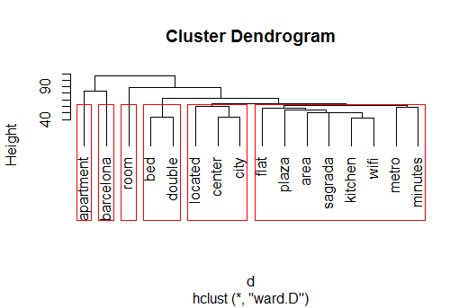
As we can see there are 6 different groups. Apartment, Barcelona and Room are considered single clusters by the algorithm. However some interesting things arise from this plot. We see that there is a lot of similarity and correlation between “bed” and “double”, this may mean that it is important to offer a double bed. Another important cluster is related to location, we find “located”, “center” and “city”, so clearly it is paramount the distance between the appartment and the city centre when advertising the accomodation.
Finally there is a last cluster which takes into account several features and characteristics of the appartment such as “wifi”, “kitchen” or even “metro” and “minutes”. So we can get a taste of what advertisers think is important to highlight.
To sum up, we have seen several Text Mining techniques to perform analysis. We have gone from more graphical solutions to more analytical tools. They all prove to be relevant when analyzing this kind of problems, however, some might be more useful than others depending on the characteristics of the data, problem etc.
Predicting Brent oil volatility
I’d like to devote this post to predict volatility of a very common asset, Brent Oil.
I’m using official data from the Federal Reserve Bank of St Louis and it is daily data with a five years time span. The main objective is to forecast future realized volatility of this time series. There are several useful techniques to correctly forecast volatility, but in this case several ARCH model type will prove to be useful.
This plot shows the evolution of the Brent oil price. It’s interesting to see the sharp drop that took place between 2008 and 2009 and the consequent increase and stabilisation of the price. This may imply some non-constant volatility or hetersokedasticity.

Firstly we’ll take the first difference to get a stationary time series. From this plot we can clearly see what we suspected. There is non-constant variance so it’s very likely that this time series has ARCH type effects.

I do not want to go into much detail about how to correctly analyze this time series as it is not the main point of this post. But it is absolutely necessary to carry out some tests like Jarque-Bera Test, Ljung-Box test among others to have a thorough understanding of how this time series behaves.
I will only do the full and proper procedure for a GARCH(1,1) model so we’ll be able to generalize it to the other models I will generate.
Note that a GARCH(1,1) model is generated as follows:
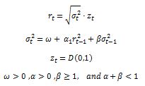
This means that our returns are a function of past volatility and past returns. It is important that the persistence parameter alpha + beta is smaller than 1 to be a stationary time series, otherwise it would be explosive. This model is more efficient than an ARCH(q) model as with fewer parameters it manages to get better forecasting results.
#specify model
garch11 summary(garch11)
garch11$residuals garch11$fitted.values garch11$residuals #plot the model
plot(in.dates,in.data$brentg, type = "l" , col = "blue")
lines(in.dates,garch11$fitted.values, col = "red")
lines(in.dates,-garch11$fitted.values, col = "red")</code>

plot(garch11$residuals, type = "l")
#look at the residuals
qqnorm(garch11$residuals, main ="Q-QPlot GARCH Residuals")
qqline(garch11$residuals)

jarque.bera.test(garch11$residuals)

acf(garch11$residuals**2)
What we have done is to specify the GARCH(1,1) model and do some analysis on the residuals to know if we are fitting our data correctly. Jarque-Bera test fails to reject the null hypothesis of normality in the residuals. On the other hand, Ljung-Box Test tells us that residuals are i.i.d. so this is quite good, as there aren’t autocorrelations which would include some error in the parameter specification.
We can see this i.i.d. fact when looking at the ACF of the residuals.
Note that the piece of code I post here does more things that those plotted here, it is for instructive purposes.
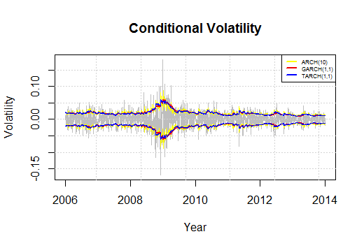
We do the same procedure and we generate an ARCH(10) and a TARCH(1,1), alternatively called GJR-GARCH model. The results for the in-sample are the following:
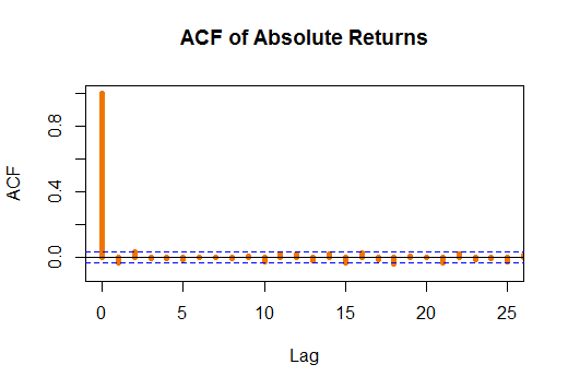
 The fact that I have chosen to generate an ARCH(10) model is not casual. I have decided to take it as the ACF gets cleant on a 10 day span, which means two trading weeks. In case we took fewer days we would still see some statistically significant autocorrelations which would mean that data is not i.i.d. Moreover, I have decided to include a GJR-GARCH model to better model negative sign bias it is to say to better model assymetric negative returns. This means that badnews imply a larger change in volatility, and consequently in returns, in absolute terms than goodnews.
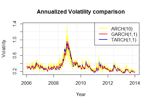
We can see that the three models behave quite similarly but it is the ARCH(10) which reacts more aggresively to changes.
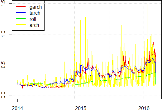
We deplot the predited values for the out-sample to see which model fits best the data. We use rolling variance, in green, as benchmark to see how differently they behave. A priori ARCH(10) has incredibly sharp changes with a very low frequency, and GARCH and TARCH behave very similarly.
To see which model has the best forecasts we compute the Mean Square Errors, MSE. All of them are compared to the benchmark of the rolling variance.
#now let's compute the errors

dates.out <- dates[ (T+1):N ]
ret2      <- brentg[(T+1):N]**2

ql  <- cbind( ret2/var.g - log( ret2/var.g ) -1 , ret2/var.t - log( ret2/var.t ) -1 , ret2/var.r - log( ret2/var.r ) -1 ,ret2/var.g - log( ret2/var.a ) -1)
mse <- cbind( (ret2-var.g)**2 ,  (ret2-var.t)**2  , (ret2-var.r)**2,  (ret2-var.a)**2  )

#MSE ERRORS
par( mar=c(2,2,0.1,0.1)  , xaxs="i" , mfrow=c(2,2) )

plot( dates.out , mse[,1] , t='l' , lwd=2 , col='red2' )
legend('topleft',c('garch'),col=c('red2'),lwd=4)
plot( dates.out , mse[,2] , t='l' , lwd=2 , col='blue2' )
legend('topleft',c('tarch'),col=c('blue2'),lwd=4)
plot( dates.out , mse[,3] , t='l' , lwd=2 , col='green2' )
legend('topleft',c('roll'),col=c('green2'),lwd=4)
plot( dates.out , mse[,4] , t='l' , lwd=2 , col='yellow' )
legend('topleft',c('arch'),col=c('yellow'),lwd=4)

mean(mse[,1])
mean(mse[,2])
mean(mse[,3])
mean(mse[,4])
In the code I have also specified the QL errors, but I do not depict them as they show very similar results compared to the MSE.


As incredibly as it may seem, an ARCH(10) model is the best one to fit the data as it minimizes the MSE, so it means that it gets closer to the actual values of the out-sample data.
To conclude we can affirm that an ARCH(10) model is the best one in terms of predictive capabilities. The three models analyzed predict higher volatility for the out-sample data and this is confirmed by the actual data. So using of this three models we can get very decent forecasting results.
In case you have any doubt about coding, explanationm whatever don’t hesitate to write me and I’ll try to clarify and go deeper in all those aspects I haven’t covered in this post.
Adrian
Analysis of departure delays from Atlanta Intl. Airport with R
I will be using the same dataset from the previous post. It’s a public dataset issued by the US Bureau of Transportation with all the US national flights between 1987 and 2012. As we did before, we make a sample of 200,000 observations from years 2007 to 2012.
I devote this new post to analyse departure delays when taking off from Atlanta Hartsfield-Jackson International Airport. The election of this airport is not casual, it’s the largest in the US and first in the world in number of passengers per year, ~120M per year. This airport is used as an international hub for transfers, where thousands of planes stop by on a daily basis. This fact implies that it’s absolutely important to manage adequately the timings and logistics when talking about departing and landing.
For this reason, I pose here a hypothesis to test: Do departure delays accumulate during the day?
This dataset includes a variable called Departure_delay, so we can analyze the delay per plane and per flight.
First of all we look at the departure delay taking into account the month.
library(ggplot2)
ggplot(dfdelmonth,aes(x=month2, y=meandelmonth2)) + geom_point(color="blue",size=3)+ geom_line(linetype="dashed",color="orange",size=1) + labs(x="Month of Departure",y="Average Delay") + theme(panel.grid.minor = element_line(colour="white", size=0.5)) + scale_x_continuous(breaks = seq(1, 24, 1))+ scale_color_manual("blue")+geom_text(aes(label= meandelmonth2, y = meandelmonth2), size = 2.7,hjust=1, vjust=1)+ggtitle("Average delay by month of departure")+ coord_cartesian(ylim=c(0, 18))
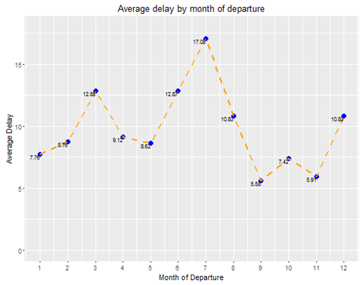
The graph is clear, in summer, especially in the months of June, July and August the average delay when departing from Atlanta Intl. Airport i larger than the rest of the year. This fact isn’t that surprising as Summer months people tend to travel around.
It’s interesting to know if delays are greater on a given day of the week. To do so, we carry out a similar technique using package ggplot to get more visual results.
qplot(dayweek2, delaydayweek)+geom_point(color="blue",size=3)+geom_line(linetype="dashed",color="orange",size=1)+labs(x="Departure day of the Week",y="Average Delay") + theme(panel.grid.minor = element_line(colour="white", size=0.5))+ scale_x_continuous(breaks = seq(1, 24, 1))+ scale_color_manual("blue")+geom_text(aes(label= delaydayweek, y = delaydayweek), size = 2.7,hjust=1, vjust=1)+ggtitle("Average departure delay by day of the week")+ coord_cartesian(ylim=c(0, 13))
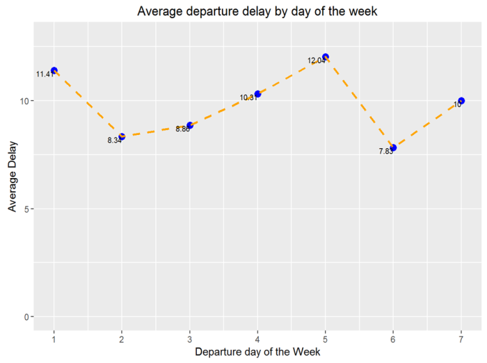
Results from delays by day of the week show that Mondays, day 1, and Fridays, day 5, are those that have a higher average delay. A possible explanation to this phenomena could be that people tend to go back to their hometowns on fridays so as to spend their weekend together with their families. On the other hand, on mondays lots of people tend to travel around the US just for business and work.
Finally, we are going to analyze the delay by hour of departure on a given day. As this is our variable of interest we are going to perform a more thourough analysis. To do so we start by plotting all our departure delays by hour of departure using a jittering technique so we may see hidden patterns in case they exist.
qplot(deptime,data1$DEP_DELAY,alpha = I(1 / 80),xlab = "Departure Time", ylab ="Departure Delay")+ ylim(-15,200)+ theme(axis.text.x = element_text(color="#993333", size=6))
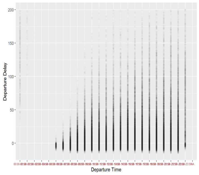
As we were suspecting there is a huge increase of departure delay when departing if we look at hourly data.
Notice that between 12am to 5am the airport is virtually closed, as there aren’t departures.
To better see the average departure delay we generate another plot:
ggplot(deptimedf,aes(x=deptime2, y=meanhour))+geom_point(color="blue",size=3)+geom_line(linetype="dashed",color="orange",size=1)+labs(x="Hour of Departure",y="Average Delay")  +
 theme(panel.grid.minor = element_line(colour="white", size=0.5))+
 scale_x_continuous(breaks = seq(1, 24, 1))+ scale_color_manual("blue")+geom_text(aes(label= meanhour, y = meanhour), size = 2.7,hjust=1, vjust=1)+ggtitle("Average delay by hour of departure")
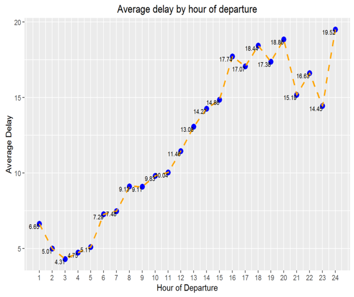
Results are astonishing. If we depart at 5am in the morning there will be an expected 5min of delay. If we depart at midnight we go up to more than 19minutes of expected departure delay. This fact reveals quite a lot; the later you fly the more expected departure delay will be. So you may have to take this into account when booking a flight.
So, so far we know that flying on July and/or Monday or Friday and/or late in the evening most likely will mean having a departure delay.
However, in another post I will model this problem with some regressions to get more insights from this dataset. By looking at the data we might have to use some kind of Poisson or Negative Binomial regression, as there’s a huge number of zeros due to the fact that we collapse all the negative delays to zero, as we are not interested in them. But this will be explained further in the following post.
Adrian
